
Ipswich Town badge redesigned. Just for fun.
As you may know, we are supporters of Ipswich Town Football Club (don’t hold it against us!) and Dan, over the years, has produced ITFC related work for TWTD. The football club was recently bought by Gamechanger 20, with money from a US investment fund. The future of the club looks bright, and fellow supporter and friend, Graeme Fayers (from the brilliant local printer Five Castles Press), suggested the badge should be redesigned to reflect this new chapter…
History
There hasn’t been just one badge in the club’s history. Their first was simply the coat of arms of Ipswich Borough Council; originally a full crest, later just the central shield:
A competition in the early 1970s resulted in the introduction of the Suffolk Punch horse as the emblem of the club. Initially a yellow and blue design, this was reworked in the early 1990s and is continued to be used today:
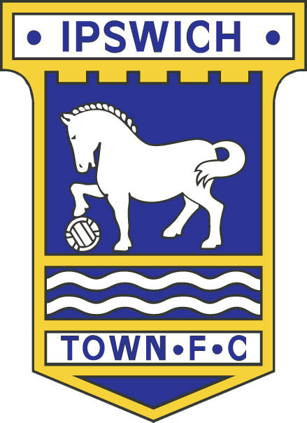
I love the club’s badge, particularly the introduction of the Suffolk Punch, but I was never particularly satisfied with either incarnation of the logo — the typography is particularly bad on the current version: I appreciate the use of Gill Sans, a classic British font, however the Semi-Bold version of the typeface used isn’t as stylish as the classic Regular version. It has been stretched, distorting the letterforms. This is particularly evident in the “FOOTBALL CLUB” text at the bottom, where the squashed double Os inappropriately look a bit like rugby balls. Regular Gill Sans is famous for letter Os that are almost perfect circles. Here they most definitely are not!
I also had issues with the illustration of the Suffolk Punch horse. It was an improvement on the original 1970s horse, which was inappropriately elegant. The stocky silhouette of the powerful Suffolk Punch is more recognisable in the current design. Despite now clearly being a shire horse, the head lacks expression, the tail is poorly executed, and the hooves just look unfinished: I find it strange how the back legs don’t appear to sit on the same plane as the front standing leg, giving the impression that they are somehow hovering in the air!
Other annoyances are the irregularity of the waves at the base of the badge (see close-up above) and the overuse of fiddly white keylines. It’s easy to criticise, but basically I think that the current badge lacks sophistication and attention to detail.
Design precedents
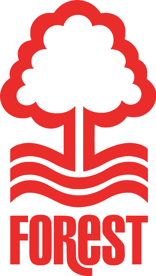
I’ve looked at other clubs’ badges to see how they have been treated, and also how they’ve evolved. Occasionally the name of the club doesn’t feature (Wolves, Tottenham Hotspur, illustrated below), or is reduced to the key name, with “Football Club” or “FC” being removed altogether, even the nickname of the side being used, as is the case with the (in my opinion) great Nottingham Forest badge: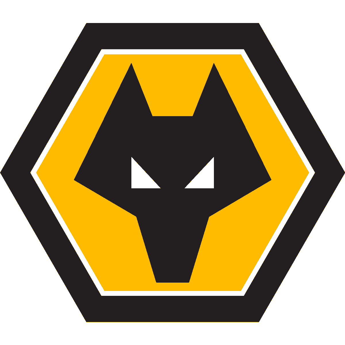

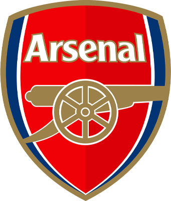
Most club badges have changed over the years — Arsenal controversially oversimplified their badge in 2002 — removing all its interesting idiosyncrasies; the strange heraldic details, and letterforms that could have been lifted direct from the Gutenberg Bible. They even took to pointing their famous cannon in the opposite direction! Too radical in my view; taking a traditional, charming, timeless design and sanitising it for a corporate world: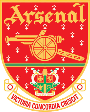
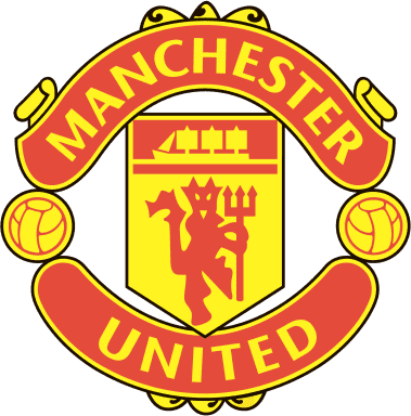
A similar mistake was made at Manchester United. Deciding to lose the words “Football Club” from their badge, United was moved down to take its place. I find it strange that the rest of the design wasn’t adjusted to accommodate the change — now “United” sits on a long hot dog shaped ribbon designed to take two words, not one. So now there it sits, with some extra letterspace added, trying to appear wider than it should be, surrounded by enough space to park a couple of open-top buses! 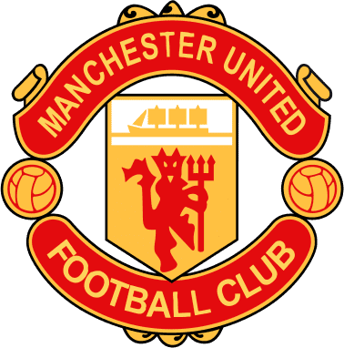
My new ITFC design
Here are some initial concepts: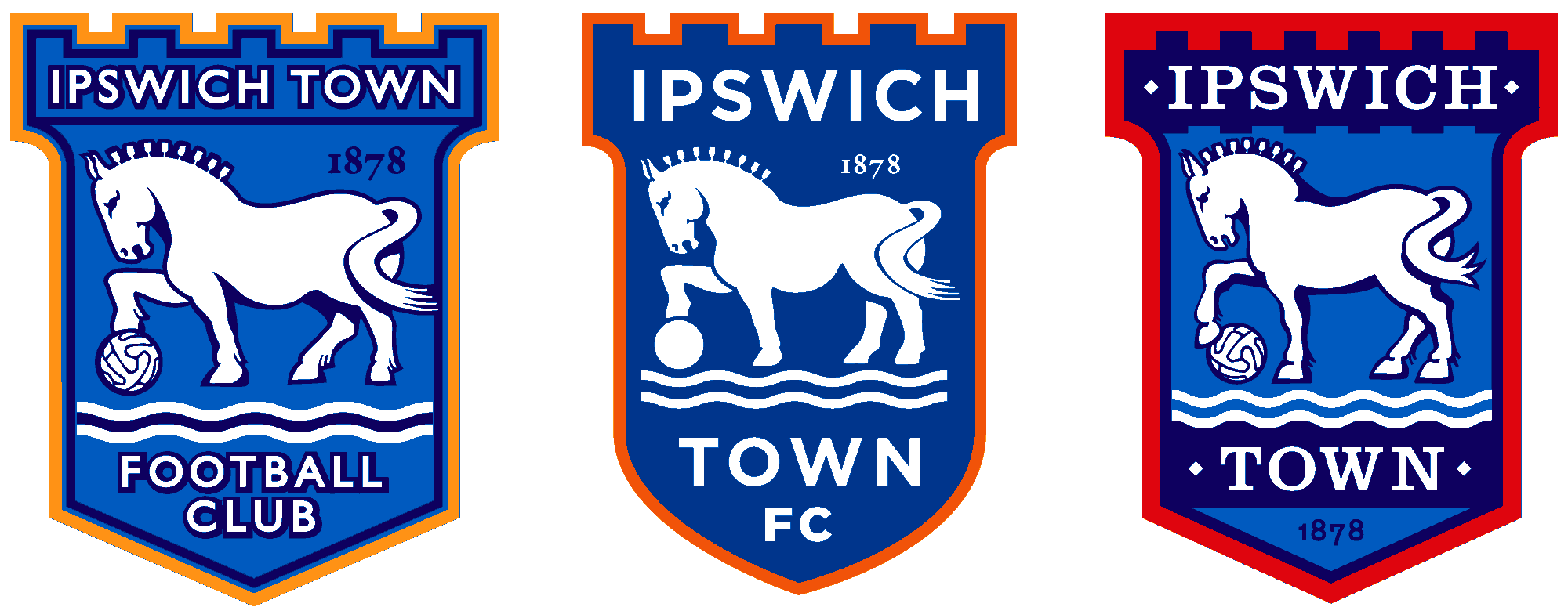
I did think the “Football Club” could be removed from Ipswich’s badge; the two words Ipswich, and Town, balance well, but as a traditionalist I changed it back to FC, as in the first version of the badge, albeit moved underneath the word TOWN. This is also consistent with the club’s url (itfc.co.uk) and the social media hashtag (#itfc). It would be foolish to remove reference to it from the badge.
For the lettering I first considered using a version of Clarendon (third design, top row, above). This slab serif font is similar to the typeface used to brand some of the club’s Portman Road stadium, but in the final design I chose Gill Sans Regular, to maintain consistency with the current incarnation. I did think it would be nice to have one or two idiosyncratic letterforms for the logo (see Forest’s wonderful R, above), so have crashed two Vs together to form a more unusual W. I also introduced ‘Established 1878’ to the design to further highlight the club’s heritage. I do particularly like the top middle design illustrated above, with its curved shield and clean, minimalistic approach. However I thought it too much of a radical departure from the current design to be a viable proposal. The same applies to the versions without a shield at all. Too much of a change?.
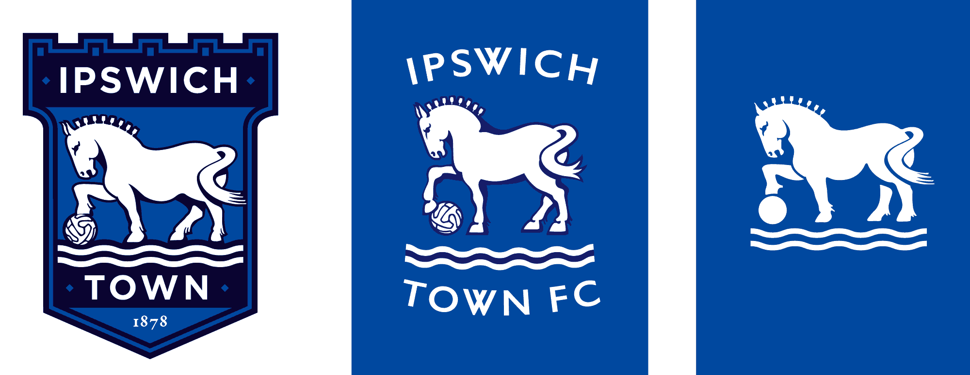
And so, here is my ‘final’ design:
I think my reworked horse looks a bit more passionate than on previous badges. I’ve added fetlock details to the hooves, and the tail is more elaborate. It was important that the horse didn’t become too cartoony and I’ve tried to keep it as realistic as possible, although perhaps the hooves do need a bit more work?
I thought the ball should change too, and have based the stitched panel patterns on balls that feature on the official FIFA World Cup posters from both 1954 and 1958.
Finally, having toyed with using orange / gold as a highlight colour, I have stuck with the current red, which I hope will be appreciated by the new American owners! I’ve also squared up the fussy curves of the crest, and reduced the scale of the crenelations at the top of he badge, to make it look more contemporary.I could have spent even more time tweaking the design. It was a great exercise to see how even minimal changes to the various elements of the badge had a big impact on the overall appearance. I have so many different variations it would bore you to show them all. I’d love to know what anyone thinks of my efforts. Why not let me know on Twitter? Norwich fans need not respond.
Addendum
I’ve received some great comments on social media and realised that I should have made it clear that my ’final’ design is anything but! At this stage of a project we would present our ideas to a client and developed the design further based on their feedback. I’m thinking that the design could be more radical — a stripped back version might be the best route to follow.